brief
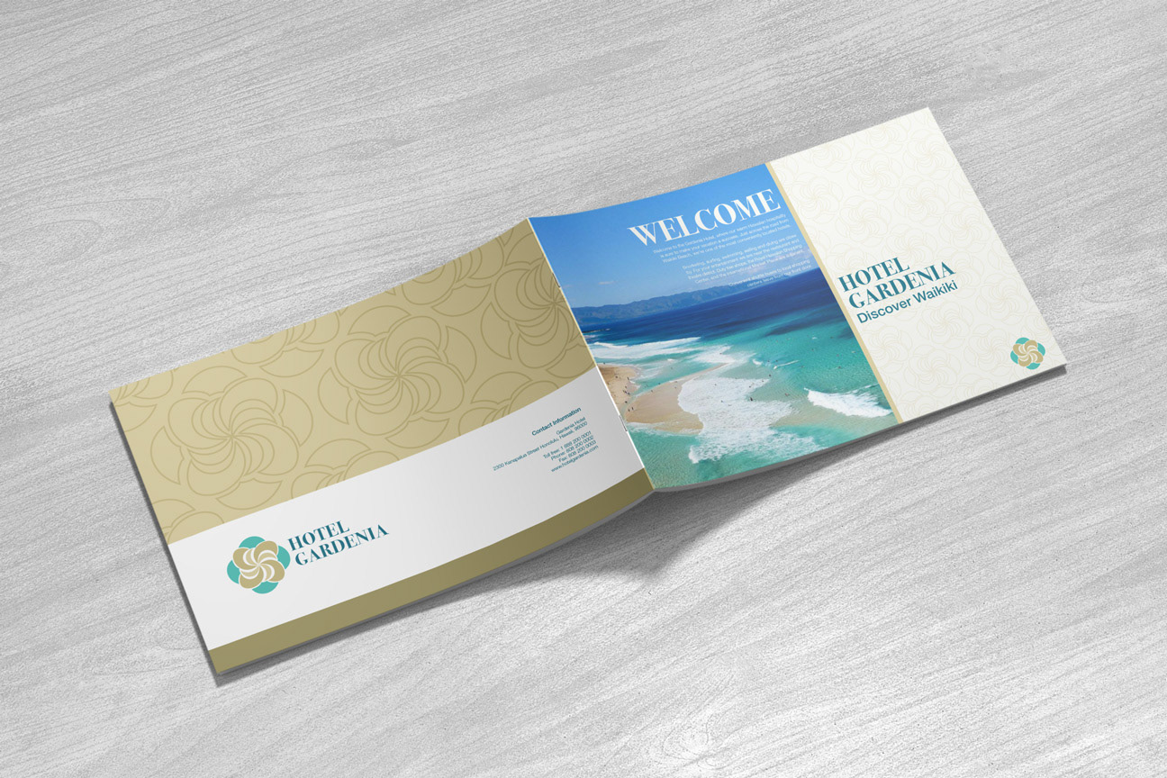
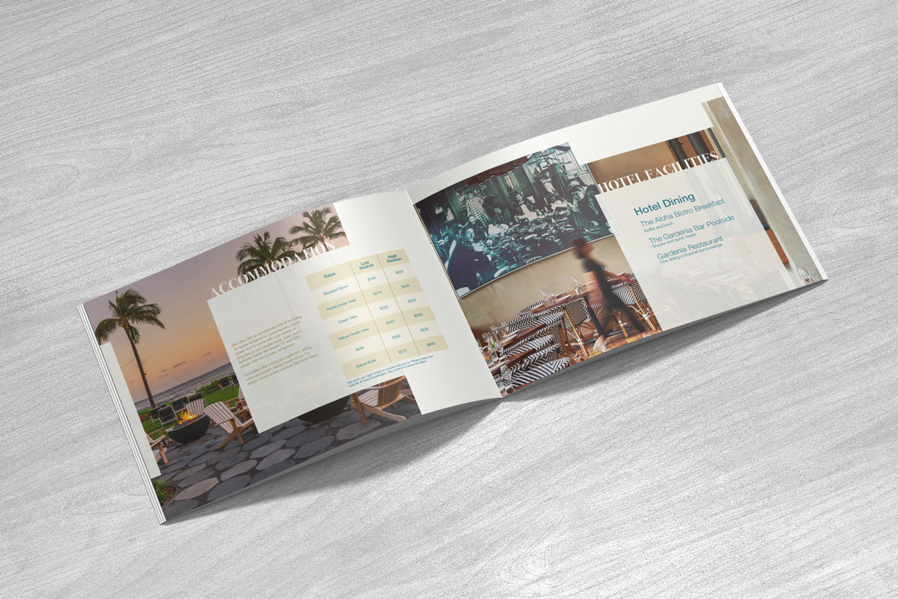
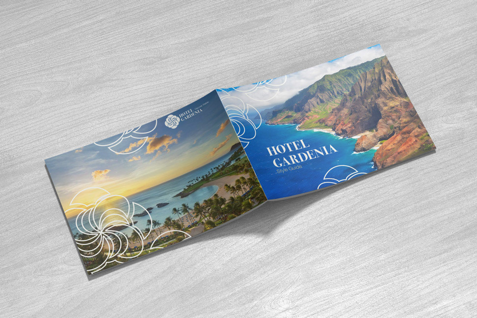
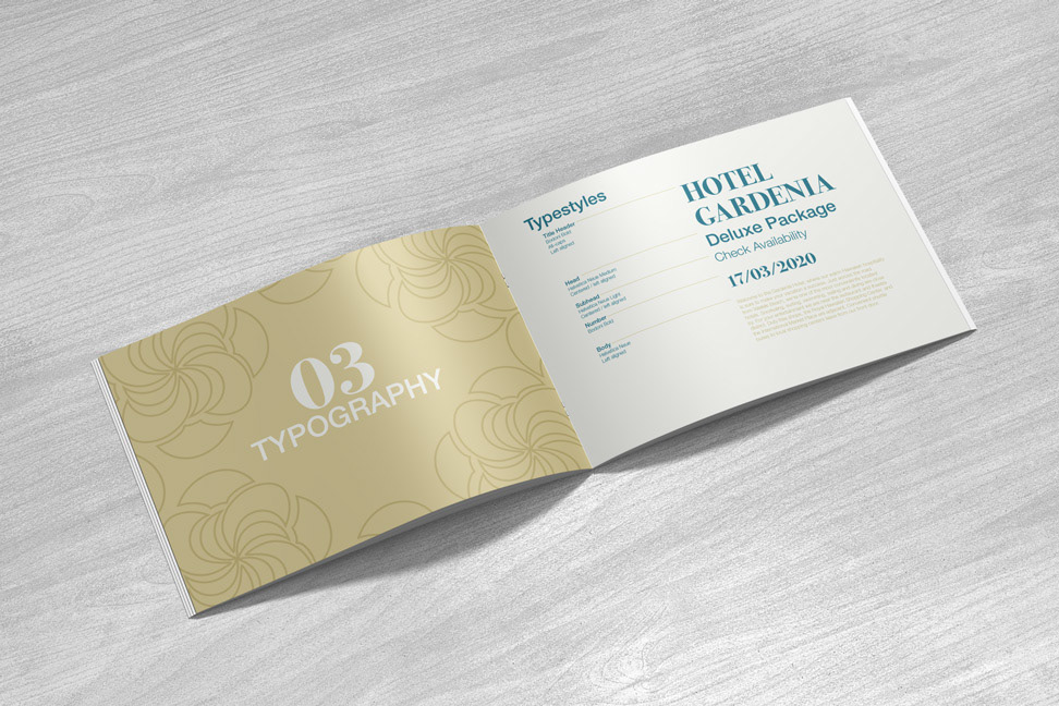
Create a multi-page brochure (print & digital) for a fictional hotel in Honolulu called Hotel Gardenia. The brochure should list information about the amenities, accommodation & event rooms. First task was to create a style guide for the hotel with a logo and a colour palette. After that, incorporate the style guidelines into a brochure and a website.
brand identity
Logo
I decided for my main focus in the logo design to be the gardenia flower. However, before I started exploring the different shapes and colours for the logo I researched a little bit the history of Hawaii and Waikiki Beach. Prior to this assignment I did not know much about it and I wanted to get a better sense of the culture and atmosphere there. I looked for keywords and descriptions of the place.
For example, Honolulu, the capital of Hawaii, means "calm port". I also, briefly, looked into the Hawaiian folklore and found out a bit about the stories of their goddesses Poliahu, the goddess of Snow & Pele, the goddess of Volcanic Fire.
I was not planning on using all my findings and research in the design for the hotel, but the sheer act of reading and researching something new led me on new ideas I otherwise would not have found.
Next, I sketched the gardenia flower in different variations to see what could work for the logo. It is a popular flower that would often be used as a decoration for hair, placed behind the ear. I sketched how I imagined the the flower would flow naturally in the wind when placed behind the ear.
Colour Palette
Following my research, I decided to use muted and calm colours, like "the calm port" would have. Hawaii is rich with nature and there already are so many colours so I did not want the colour palette of the logo to overpower that.
